Moving into a new apartment is an exciting change but at the same time an overwhelming experience. My designer’s bell went off from the first time I stepped into the property. It is time for renovation ASAP! I must admit that this one-bedroom apartment was in excellent condition. Therefore not many significant alterations were needed; instead, some styling touches that would give a character and a fresh beginning.
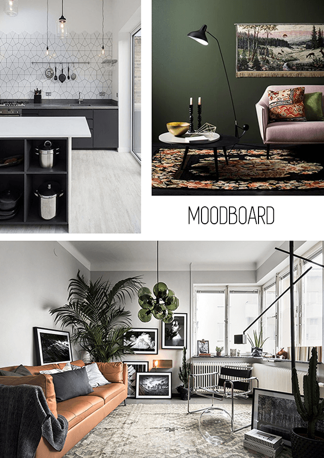
First, it was essential to identify the spatial character. By creating a Lifestyle board the direction is clear. Then the Mood Board with specific images regarding furnishing, colours, textures, and all thing relevant to decor is used to from the final composition. (Below you will see a small sample of both boards).
Since this project was my own home, the creation of a cozy ‘nest’ was my ideal place where I would go after a long day of work and unwind. Therefore, I ended up levitating towards a bohemian chic kind of vibe.
(clockwise from top left) via
1 | Green Wedding Shoes 2 | Bloglovin’ 3| Puurstyling 4 | i.pinimg
Once the vibe of the space is predetermined is essential to experience the space and identify which are your needs in order to make your accommodation the most comfortable. For me, it was clear that more storage was an absolute must as well as colour alteration of walls and the existing kitchen cardboards. As an acclaimed colour junky the existing dark brown kitchen was a dark cloud over my soul (insert dramatic music). The heaviness of this colour was uninviting, outdated and made the whole space appear smaller. To give you an inside information, colour and texture selection is one of the most defining moments in a design able to make or break the whole project therefore I had to make a new selection that would fit the direction I was going for where the kitchen would appear lighter, inviting, contemporary and the whole space larger. Another essential element missing from the space was the dining table in between the kitchen and the living room and in order to make my home as functional as possible the idea of creating a counter fixed on the wall able to double as a dining area as well as storage was the best. Through the soft furniture such as the new sofa, some coffee tables and multiple decorative elements tide up the whole bohemian concept.
1 | Home Tree Atlas 2 | Designlovefest.com 3 | Elle Decoration France
The best way to see what you designed is through the use of rendering software. Three-dimensional modelling is the architects and interior designers’ best friend (or nightmare, it depends) helping us realistically see the project in its future complete form. Therefore, when all the furniture that will be in the room are designed and selected then the final renders (aka the computerised images) are produced.
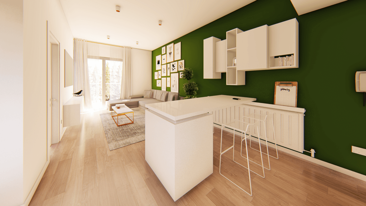
As you can see a dark olive green colour was used on the main wall expanding from the kitchen to the living room creating continuity and the main focus in the room. I thought the specific colour has a luxurious relaxing feel and due to the fact that the large opening faces South its time sensitive, altering from light to dark according to the intensity of light throughout the day!
A new corner sofa was designed to be custom made locally, the TV is fixed on the wall and a new under TV storage is designed and hanged on the wall creating the illusion of lightness. The selected wall art was hanged on the wall behind the sofa in gold, silver and wooden frames creating visual interest. A coffee table with gold details and a large carpet tights up the whole living room composition.
As I mentioned above in regard to the dark kitchen, all the kitchens cabinets were professionally coloured in white and for the backsplash, I thought of using white gloss square textured tiles protecting the wall as well as creating interesting reflecting surfaces spreading from the kitchens wall to the adjacent bathroom wall. This turned out to be one of the most interesting additions.
The new dining counter with the shelving unit on top is my favourite furniture’s of this project due to their sole purpose of storage as well as display in a playful manner. The white colour used creates a direct contrast with the dark background and the wooden floor and even though it is a large item in the space it’s not noticeable. Multiple decoration items will be used for the completion of this project which is not added on the renders such as pillows, vases, plants which will contribute towards the chic bohemian concept.
 This post was a glimpse into my creative process from the beginning to the visuals. There is no correct or wrong order of thought and process in designing a space. Follow your aesthetic and don’t lean out of the spatial identity parameters you set at the beginning. This will be the key to your success and if you cannot do it call a professional they are plenty around. I hope you guys enjoy the first post of my new venture. Feel free to let me know what you think and what you would like to see next.


[…] her apartment, but in the last two years, around 30 to 40 people cramped up in my small one-bedroom apartment. So I am turning 33 today, and it’s a party for one! Ok, two, me and my […]
[…] due to the pandemic, I would love to have more space and an outdoor area. Even though I love my apartment and it has everything I necessarily need, I find it extremely difficult to store new things […]